In lighting design and luminaire selection, color temperature is a crucial yet often misunderstood parameter. The choice of color temperature is not simply a matter of “warm or cool,” but directly impacts project quality, user comfort, and the final delivered result.
In practical projects, we frequently encounter the following questions:
- Which scenarios are suitable for 3000K, 4000K, and 5000K, respectively?
- Does color temperature affect brightness and color rendering?
- Is it only possible to use a single color temperature in a project?
This article will provide an in-depth analysis of the technical details of color temperature and offer professional engineering selection guidelines.
Table of Contents
What is Color Temperature in Lighting?
Color temperature is a physical quantity used to describe the color characteristics of light emitted by a light source, measured in Kelvin (K). This concept originates from the blackbody radiation theory in physics: when an ideal blackbody is heated, it emits light of different colors as the temperature increases, from dark red to orange-yellow, then to white, and finally to bluish-white.
In lighting applications, color temperature does not represent the actual temperature of the light source, but rather describes the visual perception of whether the light is warm or cool:
- Lower color temperature → yellowish, warmer
- Higher color temperature → whitish, bluish
It is important to note that:
Color temperature is not equal to brightness, nor is it equal to the intensity of the light.
This is one of the most common misconceptions in engineering projects and a frequent cause of incorrect selection.
What do different color temperature ranges represent?
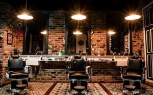
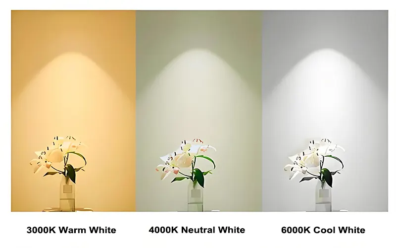
2700K-3000K (Warm White): This is the warmest color temperature range, emitting a soft, yellowish light. This light creates a comfortable and relaxing atmosphere, reminiscent of a fireplace or sunset. This range is closest to the color of traditional incandescent bulbs, making it particularly popular in spaces where a warm, homey feel is desired.
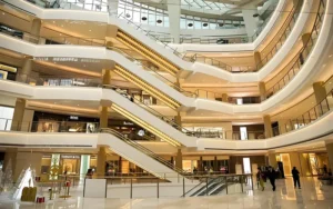
3500K-4000K (Natural White): A neutral color temperature between warm and cool, producing a soft white light. This range is neither too warm nor too cool visually, making it suitable for environments that require both comfort and clarity. It is widely used in commercial spaces and modern homes.
4500K-5000K (Daylight White): Close to the color temperature of natural daylight, the light is clear, bright, and slightly cool-toned. This range provides good visual clarity and helps with concentration, often used in places requiring precise visual work.
5500K-6500K (Cool White): A high color temperature range, exhibiting a distinct bluish-white tone. This light is crisp and bright, enhancing alertness and focus. 6500K is often referred to as “daylight” color temperature because it closely resembles the characteristics of natural light under a clear sky at midday.
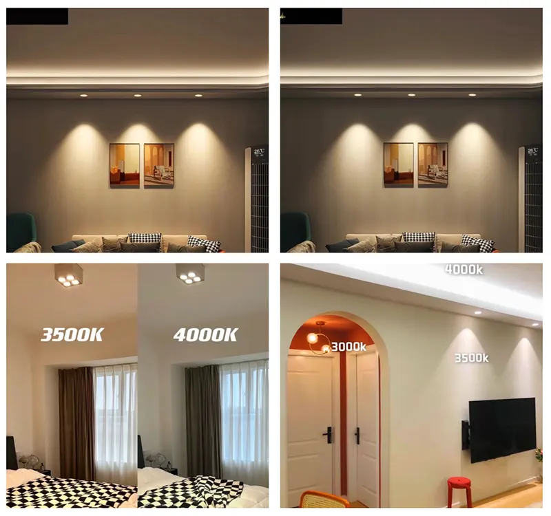
Common Color Temperature Ranges and Their Application Scenarios
In lighting projects, there is a relatively well-established industry consensus on color temperature for different application scenarios:
| Color Temperature Range | Application | Expected Results |
| 2700K-3000K | Hotel rooms, fine dining restaurants, luxury spa, and lounges. | Relaxation, intimacy, and luxury. |
| 3500K-4000K | Business hall, cafe, public waiting area | Comfortable yet modern. |
| 4500K-5000K | Open-plan offices, libraries, classrooms, retail stores | Improved focus, natural viewing experience, and reduced eye strain. |
| 5500K-6500K | Hospital operating rooms, precision machining workshops, laboratories, underground parking garages | Exceptional clarity, security, and simulated daylight. |
Common Engineering Misconceptions in Color Temperature Selection
Misconception 1: Higher color temperature means brighter light. Many people mistakenly believe that a 6500K light fixture is brighter than a 3000K one, but in reality, color temperature and brightness are two independent parameters. Brightness is determined by luminous flux (lumens) and is unrelated to color temperature. A 3000K light fixture can be brighter than a 6500K fixture.
Misconception 2: Using a uniform color temperature throughout the entire space. This lacks layering and accent lighting, resulting in a monotonous space and failing to use light to guide the eye or delineate functional areas.
Misconception 3: Neglecting color temperature consistency. Mixing significantly different color temperatures within the same field of vision can cause visual discomfort. If different color temperatures must be used in adjacent spaces, ensure a natural transition, ideally keeping the color temperature difference within 500K.
Misconception 4: Focusing only on initial color temperature and neglecting color temperature stability. Low-quality LED products may experience color temperature drift after a period of use. When choosing lighting fixtures, pay attention to the manufacturer’s commitment to color temperature consistency and stability.
Misconception 5: Ignoring the interaction between color temperature and building materials. Cool-colored light on cool-toned materials (such as stainless steel or blue walls) will intensify the “cold” feeling, potentially creating an incongruous effect; warm-colored light can neutralize cool-toned materials.
The Relationship Between Color Temperature, Color Rendering Index (CRI), and Brightness
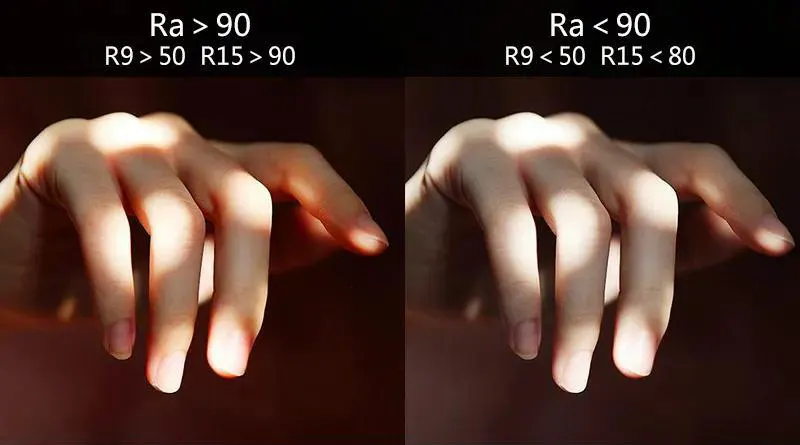
This is a frequently misunderstood technical point. Color temperature (CCT) determines the “color” of the light, while the Color Rendering Index (CRI) determines the “trueness” of objects under that light.
Color Temperature vs. Color Rendering Index (CRI): CRI measures the ability of a light source to reproduce the true colors of objects, with a maximum value of 100. Regardless of the color temperature, you should choose a light source with a CRI > 80 or > 90. A high color temperature light source with a low CRI will make object colors appear pale and distorted; a low color temperature light source with a low CRI will make colors appear muddy.
Color Temperature vs. Brightness (Illuminance): A psychophysical relationship exists. In a low color temperature environment, people can tolerate lower illuminance levels; in a high color temperature environment, higher illuminance is needed for comfort. Conversely, if the illuminance is very high but a low color temperature is used, the space will feel stuffy; if the illuminance is very low but a high color temperature is used, the space will appear cold and dim.
How to Choose the Right Color Temperature for Your Project?
- Define the space’s function: What are the main activities? (Work, relaxation, production)
- Analyze user needs: What is the user’s age? How long will they be in the space?
- Consider brand and style: What brand image should the space convey? (Innovative, warm, professional, luxurious)
- Integrate environmental factors: Is there natural light? What are the main colors of the interior design?
- Apply layered design: Different color temperature Combinations can be used for general lighting, accent lighting, and decorative lighting.
- Conduct sample testing: Before making a final decision, be sure to test the effects of different color temperature light sources in the actual site or a simulated environment.
The clearer the color temperature planning is in the early stages, the lower the adjustment costs will be later on.
Conclusion
From basic fixed color temperature selection to cutting-edge dynamic lighting environment creation, every decision should serve the ultimate goal of enhancing the user experience and achieving business objectives. Avoiding common pitfalls, as a professional lighting solutions provider, we understand the uniqueness of each lighting project. Incorrect lighting choices can lead to project rework, while precise solutions can add value to your assets.
For professional advice or project support, please contact our lighting team to obtain the most suitable color temperature solution for your project.
FAQs
Why do 4000K lights look different in the same project?
This is usually caused by color tolerance (SDCM). Even if the label says 4000K, there are subtle color variations between different brands or batches of LED chips. In lighting engineering procurement, it is recommended to choose products with an SDCM < 3 to ensure that the color differences are imperceptible to the naked eye.
Does a higher color temperature mean higher brightness (lumens)?
This is a common misconception. Color temperature (K) and brightness (lumens/lm) are two independent parameters. While high-color-temperature light often visually “appears” brighter, the actual light output depends on the lumen efficiency of the light fixture. When selecting lighting, you should focus on the lumen output rather than judging brightness solely based on color temperature.
Does the color temperature of LED lights change over time?
High-quality LED lights should maintain a highly stable color temperature throughout their lifespan. However, poor-quality or aging LED drivers, phosphor degradation, or inadequate heat dissipation can cause slight color temperature drift (usually shifting towards a higher color temperature). Choosing reputable brands and products that offer color temperature consistency guarantees is crucial.
I've heard that "full-spectrum" LEDs are better for the eyes. Is this related to color temperature?
There is a connection, but the concepts are different. “Full-spectrum” usually refers to LEDs with a more continuous spectral distribution, closer to sunlight. This not only potentially results in a higher color rendering index (CRI, including a high R9 value), but also reduces visual fatigue caused by certain narrow-band spectra.
“Full-spectrum” products can exist regardless of the color temperature. Choosing luminaires with a high CRI (especially high R9 and Rf values) and a good spectral distribution is generally more effective in ensuring visual health and comfort than simply focusing on color temperature.
Which is more important: color temperature or color rendering index (CRI)?
In professional lighting projects, both color temperature and color rendering index are equally important.
Color temperature determines the overall visual atmosphere, while CRI determines whether object colors are accurately reproduced. Even if the correct color temperature is chosen, a low CRI will still negatively impact the visual quality of the space.